

🎉 Stashable was acquired by MakeSpace in 2019.
About
Stashable is a pioneer in full-service storage changing the way people think about storing their belongings. Stashable gives users the ability to schedule appointments online, to have concierge associates pick up items from their home, store them in a secure warehouse, and deliver them when needed, without leaving their apartment.
Brand recognition, customer conversion and acquisition were our primary focus at the early stage of the product development.

My role
At Stashable, I owned the end-to-end design process of customer experience, including the initial user study, persona refinement, the brand site’s landing & conversion pages redesign, order flow, customer inventory portal, email systems, also helped build and maintain the design system.
Design year: 2018
Proto-Personas
Before we get started, we created our proto-personas which provide a foundation of our MVP design, with articulating who the target audience is, what their needs are, and how they behave. We validated these assumptions on an on-going basis.

The MVP
Based on our competitor analysis and market research, we launched our MVP. The MVP is focused on the marketing pages and the order flow which is for users to schedule an appointment. We clearly documented the user flow and wireframes with robust annotations, indicating how to receive and send data.

User study
Stashable’s primary target segments are: new couples, young parents, urban dwellers, and empty nesters. In order to understand these segments better, we had small focus group discussions and conducted one-on-one interviews with current and potential self storage customers in a few cities including New York City, Denver, San Francisco and Dallas.

1:1 interviews
The goals for the study is to understand how users found their current storage solutions, why they picked them, and what they wish could change about their current storage solution. We also wanted to get insights about:
• Do people understand our service offering?
• Is there a generational split between people understanding that they don’t have to visit a storage unit to use our service?
• Is our new way of doing things exposing differences/fault lines in the existing self-storage user base, and if so, where are those fault lines? generational? use-case-based?

Research synthesis
I generated an affinity map to have a better overall picture of the takeaways from the user study.
We’ve learned that:
1. Price and convenience (proximity) are the main two motivating factors.
2. Providing a sense of inventory control is important, given that users would like to have a clear idea of how their belongings are organized and whether safely stored.
3. People do not like to visit storage, not even want to think about it.
4. Most of the users did not get the value of Stashable by browsing the current homepage or FAQs.
How might we

From the user study, we discovered that people thought they would need to access their storage to control their stuff, but actually the bottom layer of the desire is the “sense of security”.
How might we provide security for their belongings?
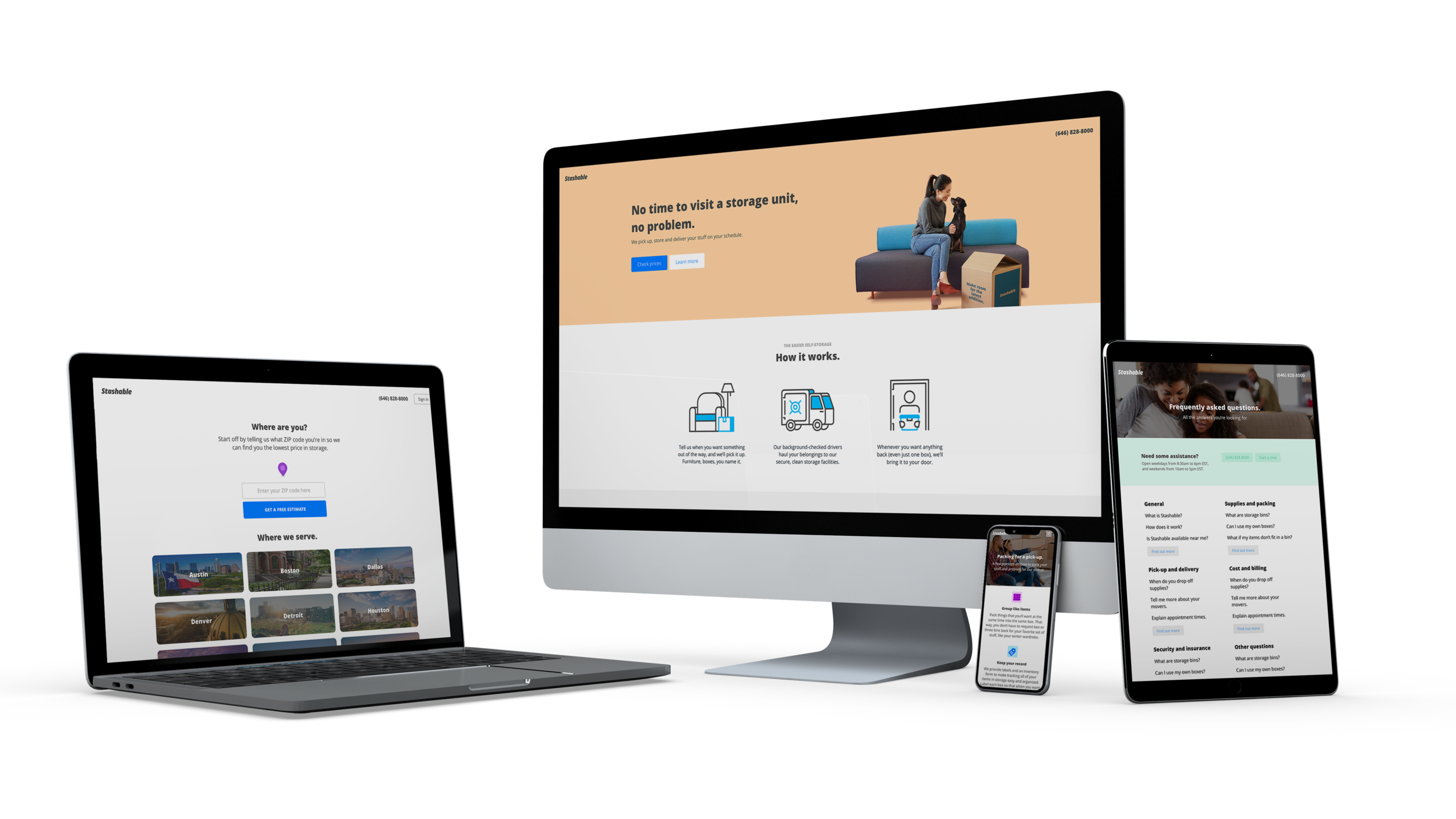
The new customer-value-driven conversion pages
With all these feedbacks, we launched our new city landing pages and segment pages, with improvements on the information architecture and design.

Test and result
The initial A/B testing has shown that the new design direction is outperforming the previous design direction.
The member experience
After the user interviews, we further believed that creating an easy way for customers to view their stuff, organize it, management appointments is very significant in order to get more buy-ins. We decided to implement the customer inventory custody feature as soon as possible.

Creating an account
In order to deliver an extraordinary member experience, we’d need to make sure the sign in process is seamless once user becomes a customer.
A clear user flow is very important in the sign in process, which involves email and password errors, forgot password and create a password.


Inventory Dashboard
We started the inventory management strategic planning, product discovery and whiteboarding. The most challenging part is members’ re-visit flow, which involves pick-up, supply-drop, and inventory delivery, and when all these actions happen together (we call it swap).

User flow
I mapped out a few different flows, but they all didn’t seem seamless to users. Then we put all the different scenarios on the whiteboard, broke the giant map into smaller pieces, regrouped the information, and we found the magic.
We were able to make the overall map more linear and streamlined with breaking the whole order into actions, and guiding the user step by step.

Prototyping and testing
Users are able to schedule a new visit, reschedule their appointments, view photos of items that they stored.


Enabling an easy and seamless way to retrieve items from storage.
The overall goal was to make this as users’ “online hub” to view and interact with their stuff in storage.
Always improving the order flow
From the user study, we have an in-depth synthesis of the customers’ needs and pain points in booking storage units and managing their stuff. We took a further step to revisit our current order flow, brainstormed and made some improvements.
• A/B testing on different approaches to helping users understand the plan capacity
From the usability testing, we’ve learned that most of the people do not have a good understanding of dimensions. Purely providing the numbers is not intuitive enough for users to pick a plan.


• Streamlined the experience of getting answers during the order flow
We understood that users have found questions during the order flow, such as what is the minimum terms of stay, how many supplies they would need, what is the service fee, etc. We placed an "I have some questions" link that opens up a Q&A modal which enables user find answers immediately without leaving the order flow.

• A more user-friendly date & time picker
The new design approach enables user to quickly glance the available dates and time slots in each day, without clicking on two drop-downs to pick the desired appointment time.
Based on testing and data
In order to lift our customer conversion, we conducted usability testing, ran A/B and multivariate testing. Based on testing results, we constantly improved the user experience of scheduling an appointment through our web, the design of landing pages and text pages, including but not limited to Pricing, How-it-works, Location, FAQs, Cancelation policy, and Packing tips.
Email systems
To further enhance the cohesion of customers, we also created an email system. We revamped the design, including marketing emails, and system emails that streamline the customer onboarding experience, and account management experience.

Marketing campaigns
In order to build awareness and memorability of Stashable, create top of mind awareness of a full service and on-demand offering, with responding to our new brand guidelines, we partnered with marketing team to create a new marketing campaign that includes billboards, social media, and pop-up ads. Our goal is to deliver a Stashable image that is fun, engaging and flexible.

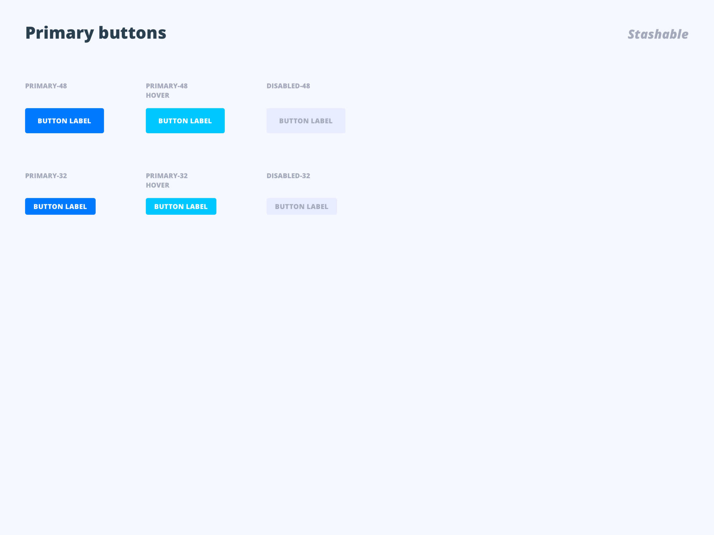
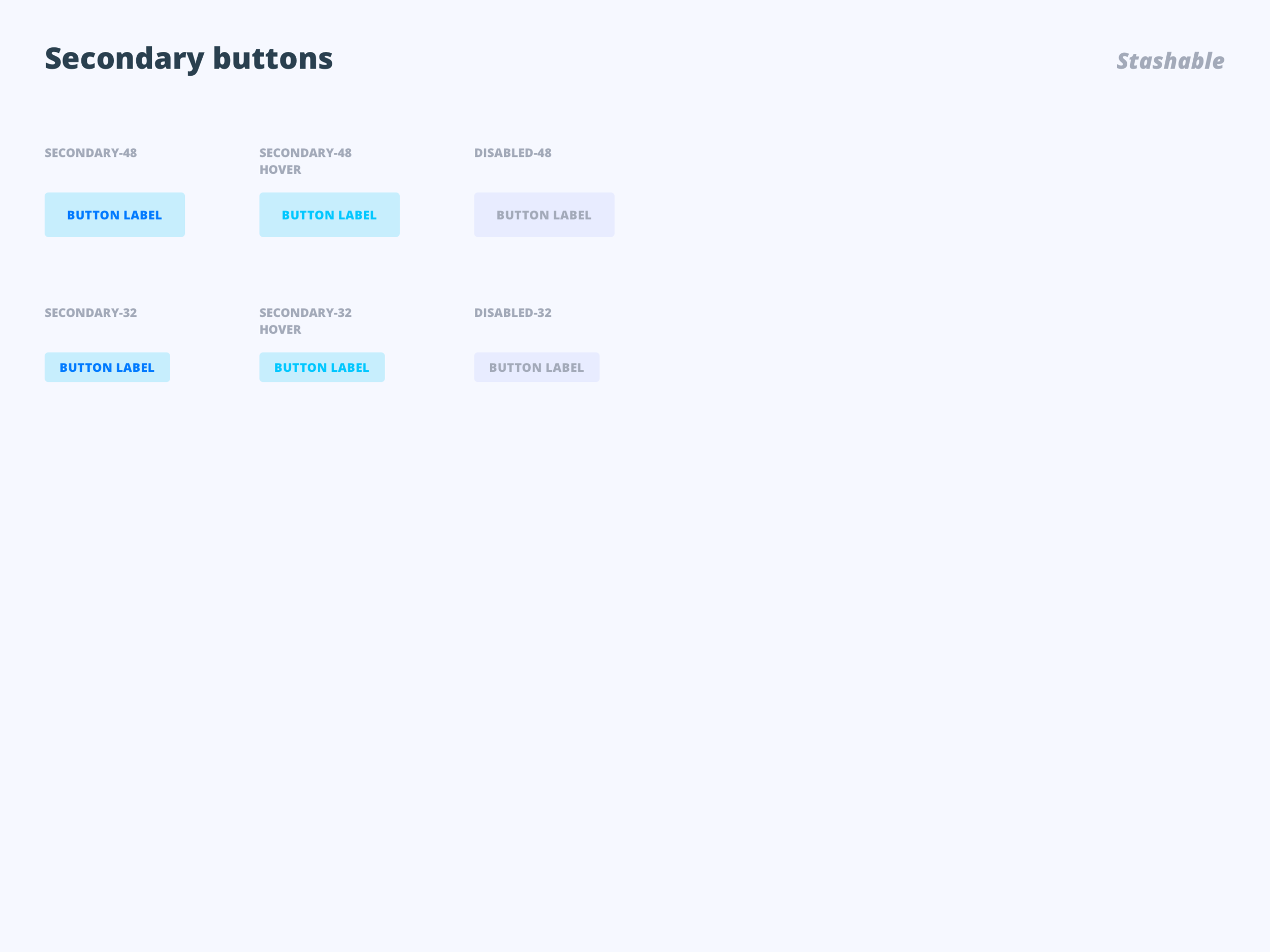
Design system
With the team, we also created a design system made easier to scale design patterns and components, ensuring consistency and quality across all experiences, and increase the speed as well as creativity of designers without losing best practices or consistency within the product.
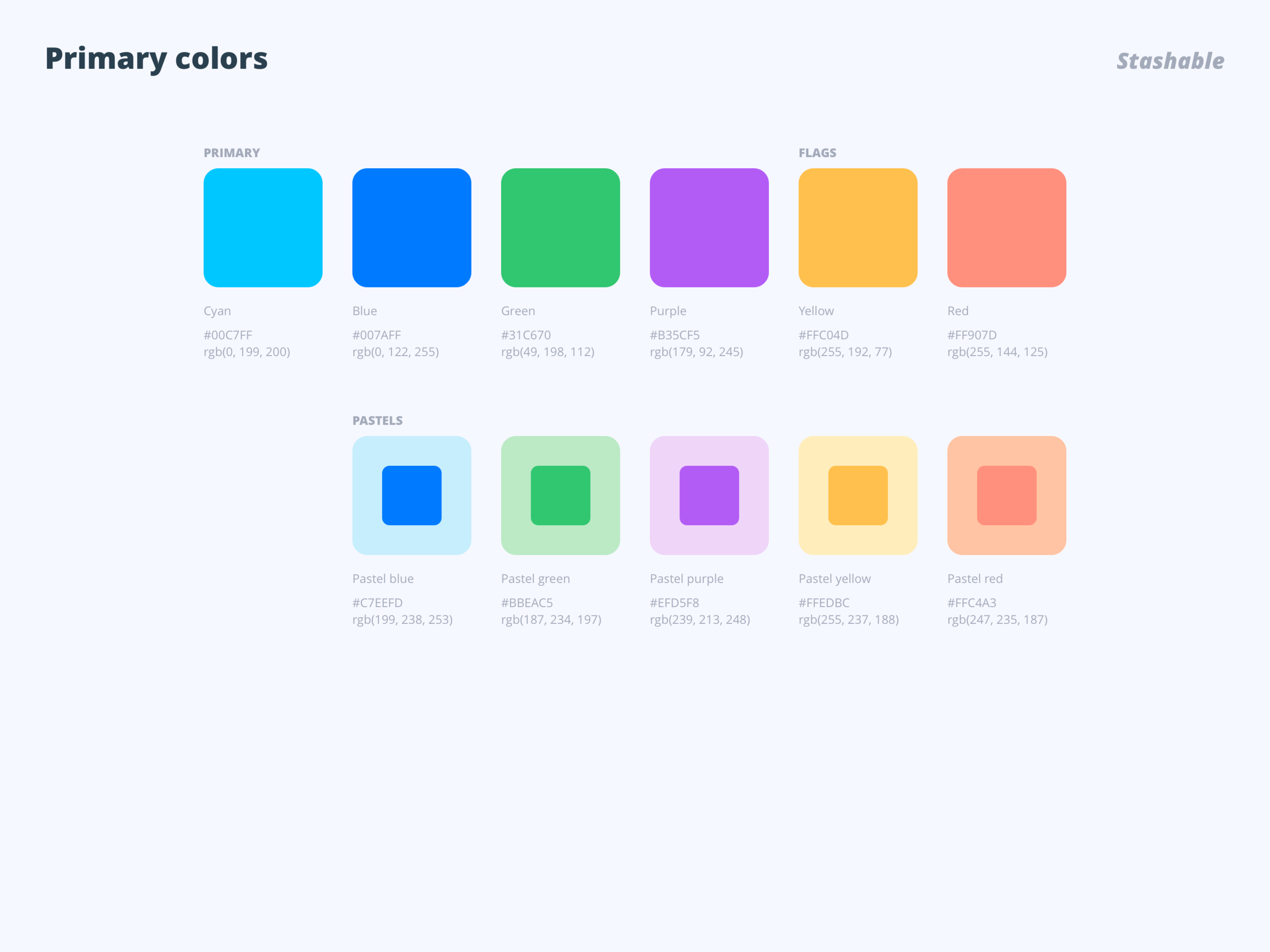
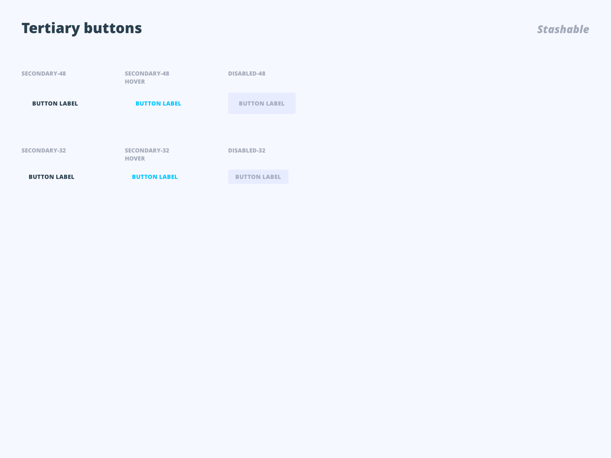
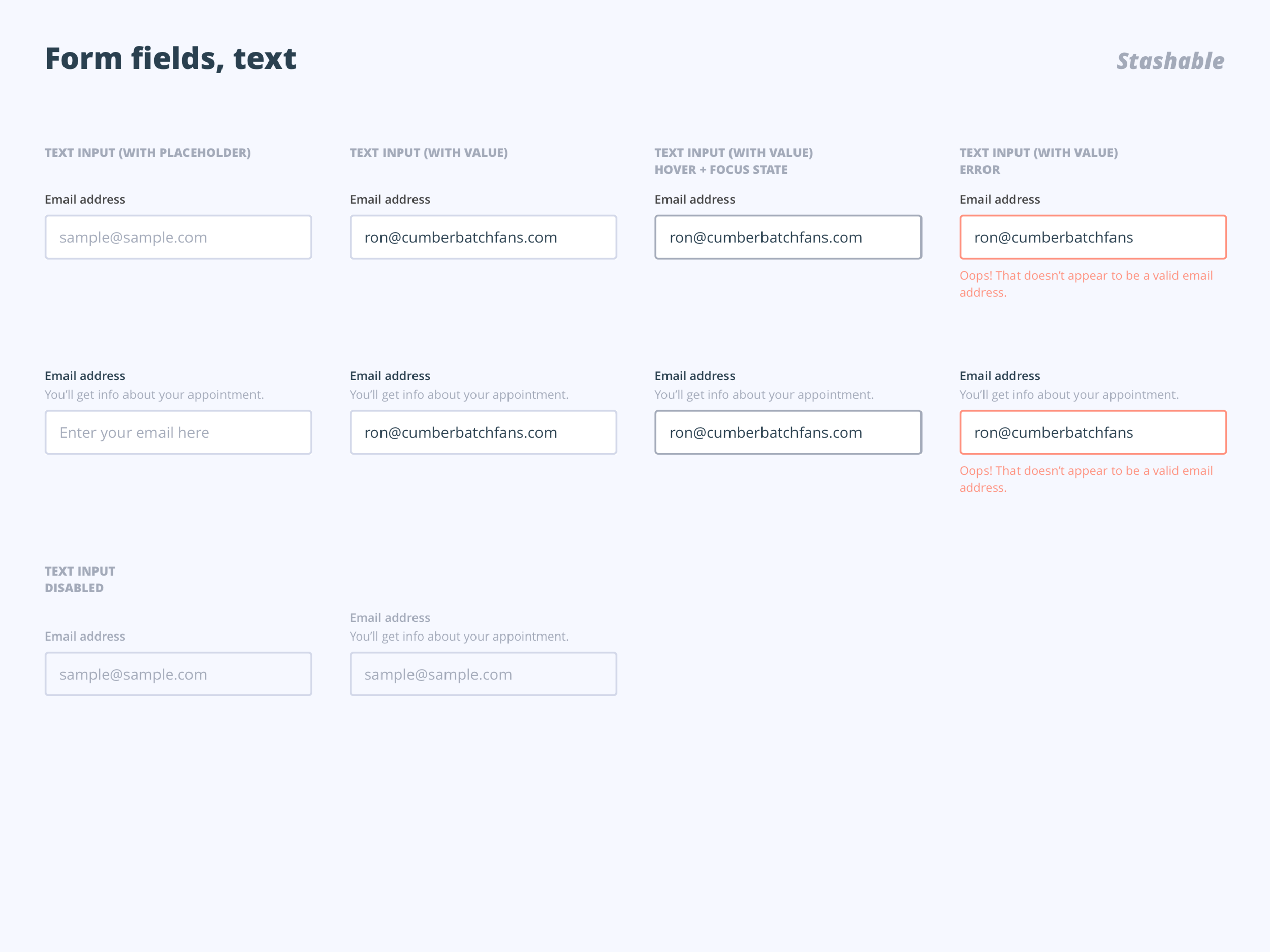
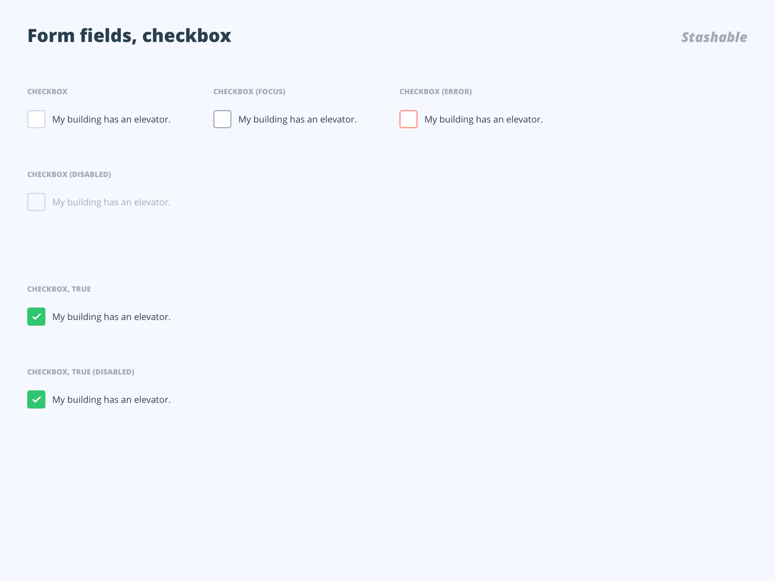
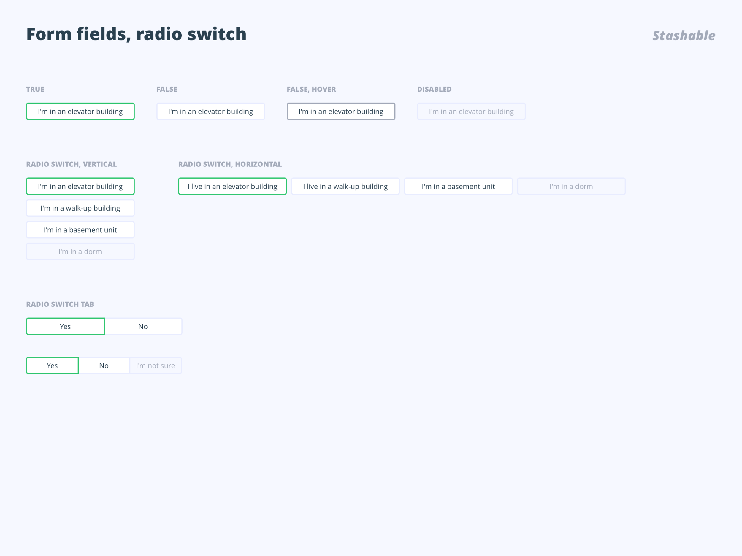


To respond to the design and color trend, besides updating our current system icons, we also chose dual-tone to be our brand icon design. I redesigned the mobile menu and desktop menu in order to enhance the visual experience.

Brand guidelines
To ensure brand consistency throughout the collateral that we produce, we created Stashable brand guidelines that are shared with our internal teams and third-party partners.

Results and takeaways
Within a year, we successfully raised conversion funnel from .4% to 3%, lengthened terms of stay from 10 months to 12 months through product rebranding and strategic design.
User/customer experience expands beyond the product software itself. As an early stage startup, building the fundamental reputations and customer trust is critical, and it should start with the user's first interaction with the brand itself–the design.
Understanding the users from the ground up is the key that drives design directions. Testing and data should be our core that enables better experience designs.
The team
Design Director Anthony Foster